(2) Drawing with Typesetting
When I started working as a typesetting operator in a company, I was absorbed in drawing with typeset characters.
The images shown in [3] were made by printing parts of kanji and hiragana of Ming or brush style using a photocomposer with a display (PAVO-KVB, Shaken Corporation), rotating images and changing the characters into narrow or wide style. I remember it took about three hours to complete.
I used a picture of a bee as a base. I put transparent graph paper over the picture, drew the same lines as on the graph paper on the display (using a function that allowed me to avoid drawing on the photographic paper), and I typeset characters using the lines as a guide. I typeset each character four times using the same value in height and width.
I put a screentone on the photographic paper in advance, so that a pattern showed up with the light passing through the transparent parts of the screentone. The pictures in [4] were made the same way.
I typeset characters in order to draw pictures using this method for some time. Why did I become so easily absorbed in typesetting? I think one of the reasons was that I majored in design in college (though I left before graduation) and I naturally enjoyed drawing. Moreover, that was the time when I pursued beautifully composed typesetting to the utmost limit as a typesetter, in addition to typesetting without error as mentioned before. Composed typesetting means printing all character elements on photographic paper for typesetting in a complete state.
Unsurprisingly, composed typesetting is delicate and demanding, requiring much time. Therefore, the usual method used in daily work was to typeset separately to a certain extent and to compose the detail in the mechanical for reasons of productivity. Separate typesetting means typing characters on the premise that the characters are printed per block and a page is composed by cutting and pasting the printed characters on the mechanical.
Clinging excessively to the use of composed typesetting may be seen as a certain smugness as an operator. However, considering the following history of printmaking, composed typesetting has been common in computer typesetting as well as DTP, and there has been no concept of typesetting separately and composing the details on the mechanical. It may be said that I was ahead of my time.
While I continued to draw pictures using parts of typeset characters, I thought of a method to draw pictures using character strings along free curves with shading. The image shown in [5] is photographic paper made using that method. I used a picture of “Blowing into a ‘popen’” by Utamaro (a famous ukiyo-e in Edo Period), and the text of “Five Women Who Loved Love” (a novel in Edo Period) by Saikaku Ihara.
I made this work in three days using a photocomposer PAVO-KVB of Shaken Corporation, spending the nights in the office during the Golden Week holidays in 1989. I stayed in the office because I didn’t know how much time it would take. In addition, the characters on the display of PAVO-KVB would disappear and not reappear again once the power was turned off.
This time was at the top of the bubble economy, and no doubt it was also the golden days of typesetting although a young typesetting operator like me had less to do with it. The economy was so booming that some companies went bankrupt due to a shortage of labor, something unimaginable these days. The help-wanted magazines were full of help wanted ads calling for typesetting operators, and the operators easily switched companies if they were dissatisfied. The president of the typesetting company, my coworkers and I never even dreamed that only a few years remained for us to get paid for typesetting…
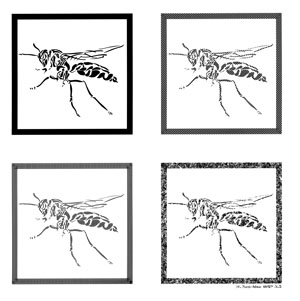
[3] Illustration made by typesetting
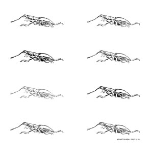
[4] Illustration made by typesetting
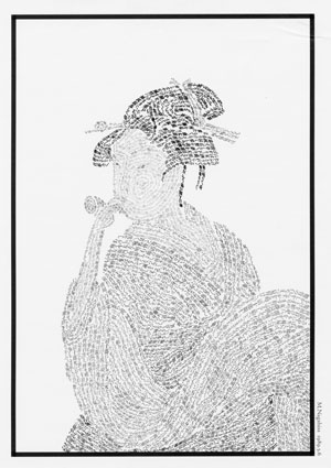
[5] “Blowing into a ‘popen’” drawn with typesetting