(3) Going independent and the present state
I bought a manual photocomposer the following year. The price was about six million yen. Since it weighs about 450kg, I relocated to another rented accommodation. The price of a word board is about 70,000 yen for one font type, but it has only 2,800 characters or so. Unlike European languages, Japanese texts use a lot of kanji and the number of characters is insufficient to make a satisfactory composition, even for general texts. I also needed the word board of JIS code 2nd level kanji as well as those of 3rd level kanji and orthographic and universal characters. It cost about 150,000 to 200,000 yen to procure all types of boards (the price differs depending on the font type). I think it cost about 8 million yen, including the photocomposer and some word boards. Needless to say, I bought them on a 5 year installment plan.
I bought a LEONMAX ZOOM1 by RYOBI, and the number one reason for choosing it was that the printing data such as coordinates, series and image rotation of characters could be recorded in a separate memory card for reproduction.
I didn’t use the photocomposer for work but I devoted myself to making my own creations, using it for about a half a year. One of the works was “The Fickle Type” shown in [6].
Although I wasn’t working on just this every day for half a year, it still took substantial time. First, I drew lines as a guide for a coordinate axis [7], and I remember it took about one week. Now you may able to make it only by scanning the design, revising the level, adjusting the color tone and arranging the lines with Photoshop. However, scanners for a photocomposer did not exist in those days. My photocomposer was not equipped with a mouse and was unable to draw free curves. The only way to draw curves was to draw a circular or elliptic arc after specifying the angle, tilt and radius. I had no choice but to continue patient work making a guide of elliptic arcs with films, applying them to the picture calculating the values of the best suited curve and drawing lines one by one on the screen. After the rough design was completed, I recorded characters on a memory card little by little every day.
Thus the typeset photographic paper on which the most time and effort were spent in human history was completed. Its greatest complaint is that it’s not nice to look at :-)
Moreover, it would be meaningless to explain the time and effort put into making it if you lack interest. Now it can easily be made with Adobe Illustrator and some patience.
I contacted some designers in an attempt to sell this work. Some showed no reaction and some seemed to be interested. With this as a start, Mr. Hitoshi Suzuki, a designer, offered me business on a regular basis. One work was used as an illustration [8] on “Yomu “ (read), a magazine published by Iwanami Shoten, for which Mr. Suzuki made designs and I was in charge of manual typesetting.
Moreover, another work of mine was adopted as an illustration for the package of “Fudegurume” (software for making postcards) [9], which was designed by Mr. Hideki Togashi of Performance Incorporation. I remember roughly 600,000 yen was paid into my account as the fee for typesetting (illustration?). I think it is a record that can be put on the Guiness Book of World Records as the “price for one typeset photographic paper”.
Back in those days (1990) when I was trying to sell my work carrying around the file of the photographic papers, one advanced typesetting company and a designer of the company’s client said to me, “These are very interesting, but the era of typesetting will end soon”. They said this because they thought DTP using Macintosh computers would become widespread. Though I also knew a little about Macintosh computers, those were used by only a few advanced designers on an experimental basis and I didn’t expect that they would prevail. Fortunately, I had enough typesetting jobs until I paid off the loan for the photocomposer. I might have been in trouble if I had gone independent a couple of years later.
Since I spent much energy on manual typesetting in my 20s and the first half of my 30s, I have much more to tell.
I would like to increase the number of pages of this website bit by bit over time.
July, 2010
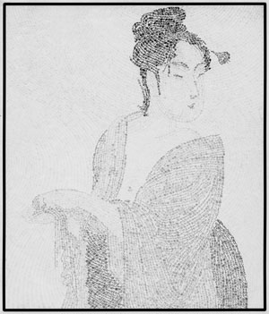
[6] “The Fickle Type” made with typesetting
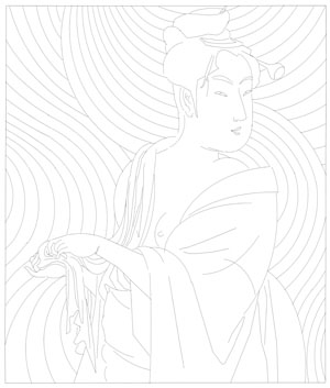
[7] Lines as a guide to draw the image by typesetting.
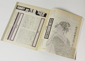
[8] “Yomu” (magazine), December, 1992
issue, Iwanami Shoten
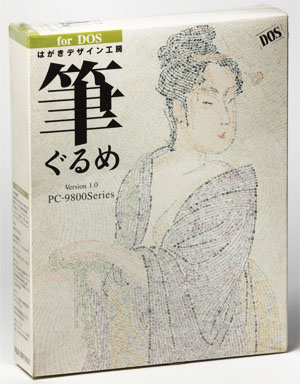
[9] Package of “Fudegurume” (PC software)
FUJISOFT Inc.